Product ad examples: the layouts, offers and copy ecommerce ads repeat
A product ad has one job: make a specific item look worth buying today. This page covers the layouts and offers that keep showing up in ecommerce Facebook ad examples, how the approach changes with price, example copy, and a five-minute routine for pulling real product ads from the Meta Ad Library.
Real ads from the public Meta Ad Library, each with our read on why it works. They belong to the brands that run them; we do not know their results.
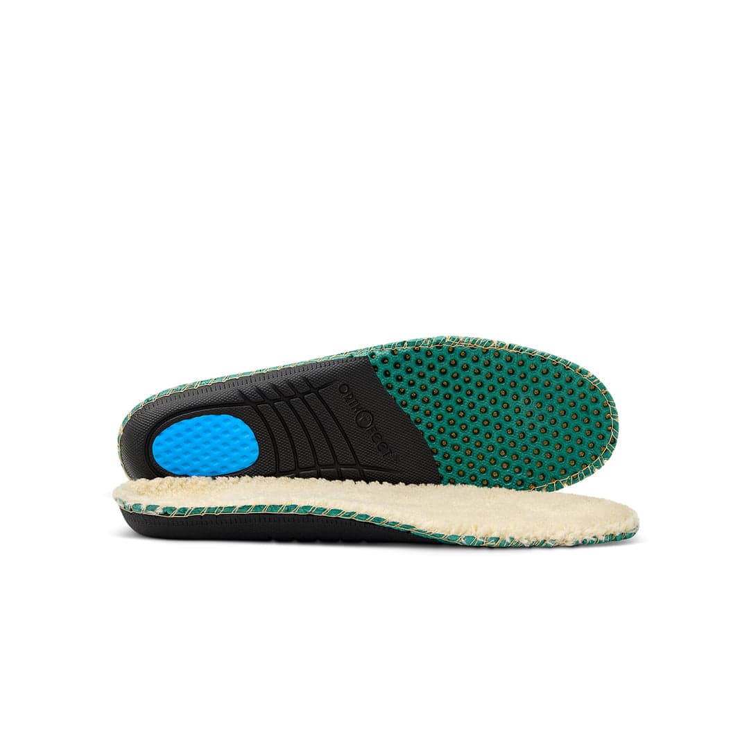
OrthofeetRunning since June 2026
Catalog ad · Facebook + Instagram
Walk Pain-Free or Money Back
#1 Orthotic walking shoes for pain free days. "Where have these been all my life? Total comfort straight from the box! So thankful to find these to wear for work - on my feet all day.” -Julene Baars 👉 Recommended Shoes…
CTA: Shop now
Hook: "Walk Pain-Free or Money Back" as the headline over a cushioned orthotic insole.
Why it works
The device is risk reversal: the guarantee sits in the headline, so the buyer's biggest fear (shoes that do not help) is answered before they read on. The copy adds authority ("Recommended Shoes by Podiatrists") and a named customer quote about comfort straight from the box, plus free shipping and returns.
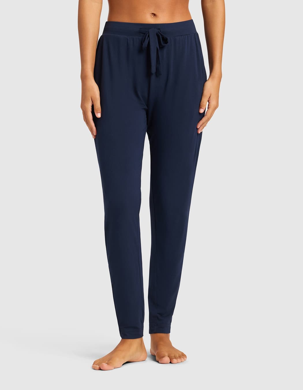
Your favorite outfits should be the ones you feel best in. Cozy Earth women’s apparel pairs premium comfort with elevated, easy-to-wear styles made for real life.
CTA: Shop now
Hook: A pair of navy joggers worn on a body cropped from the waist down, bare feet, on a plain light background.
Why it works
Cropping to just the legs puts all the attention on fit and fabric drape, which is what a comfort brand sells. The headline "Your New Everyday Uniform" gives the buyer a reason to own several pieces. As a catalog ad, it can rotate through the range so each shopper sees the items they are most likely to want.
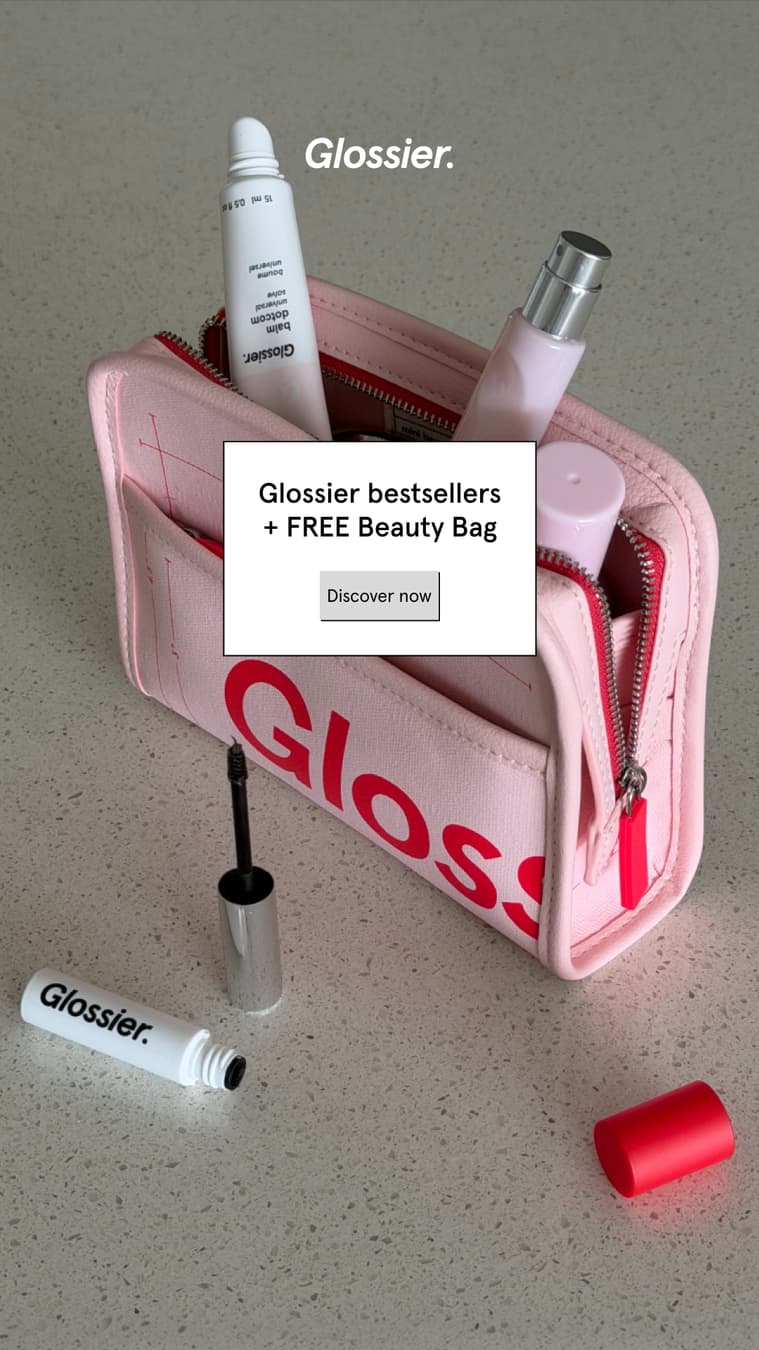
Your introduction to Glossier. Meet the Glossier Icons Set: Boy Brow, Balm Dotcom, Glossier You + Mini Beauty Bag.
CTA: Shop now
Hook: A pink beauty bag spilling out lip balm and a mascara, with the text "Glossier bestsellers + FREE Beauty Bag".
Why it works
"Your introduction to Glossier" tells a newcomer this is the place to start. The free bag is the offer, and the picture shows it. Four named products in the copy make the set easy to understand.
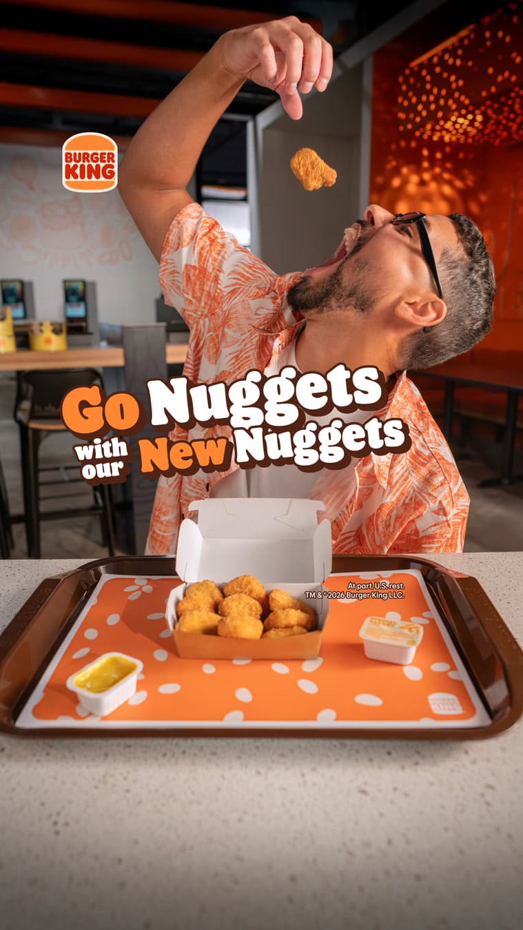
Our New Nuggets cause excessive dipping and an uncontrollable urge to try all four tastier sauces.
CTA: Order now
Hook: A man tosses a nugget into his mouth over a tray, under "Go Nuggets with our New Nuggets".
Why it works
The mid-air nugget is a fun, unposed moment that stops the scroll. The copy jokes that the nuggets "cause excessive dipping", selling the sauces without listing features.
La paciencia es una virtud… dijo nadie nunca 😶 Esperamos que veas la F1 con Doritos®, ¿eh? No nos falles 🔥😭
Hook: A woman at an office desk eats a chip while a Doritos bag sits on her lanyard, under "La F1 se ve con Doritos y PUNTO" (F1 is watched with Doritos, period).
Why it works
The copy is all teasing: "Patience is a virtue… said no one ever" and "Don't let us down." It talks like a friend, and the office setting shows someone sneaking a snack while they wait for the race.
From the beaches of Fiji to the Deep Sea. Old Spice: Different scents for different gents.
CTA: Shop now
Hook: A shirtless man in a towel stands on a bamboo raft in turquoise water and says "Hello."
Why it works
It's the original Old Spice formula in one frame: direct eye contact, an impossible location and a single confident word. The crate behind him reading "Smell like a man, man" is a wink for long-time fans. "Different scents for different gents" turns a scent range into a rhyme.
Ecommerce Facebook ad examples: the layouts brands keep using
This page is not a gallery of every product ad, and we do not invent ads. A few annotated catalog and product ads from our small snapshot of the Meta Ad Library may appear here as samples, not a count. These are the layouts that repeat.
Clean hero: the product alone on a plain background with one line of copy. Catalog ads are built on this.
In use: the product in hand or in a real room, so scale and purpose are obvious.
Problem and fix: the annoying situation, then the product solving it.
Comparison: your product next to the usual alternative, using only facts you can prove.
Bundle or offer card: what is included, the price and the saving.
Review overlay: a real customer line over the product shot.
Feature callouts: arrows or labels on the product, each naming one benefit.
Ecommerce Facebook ad creatives change with the price
Cheap impulse items need a fast demo and a clear offer. Mid-priced items need reviews, a comparison and a returns promise, because the buyer hesitates. Expensive items need a longer video or a founder story, financing if you offer it, and retargeting that carries the decision across several visits. Consumables lean on bundles and subscribe-and-save, since the profit is in the second order.
Match the structure to how much doubt your buyer has, not to what looks best in a mockup. The product ad template gives you layouts to start from.
Example copy for product ads
Example copy, written for this page. Harbor & Pine is a made-up cast iron brand.
Offer card. Headline: "Pre-seasoned skillet and lid, one price." Primary text: "Ready to cook tonight. Free returns for 30 days." Button: Shop now. Use the returns line only if it is true.
Problem and fix. Headline: "Eggs sticking again?" Primary text: "Our skillet ships pre-seasoned, so you cook on day one." Image: a fried egg sliding out of the pan.
Catalog ad. Use dynamic text so each shopper sees the name and price of the product they viewed, with primary text like: "Still thinking it over? It is waiting for you."
What to test first
Test the image first, because it decides whether people stop. Then the offer: free shipping against a percentage against a bundle. Then the first line of copy. Then a catalog ad against your best hand-built creative. Change one thing per test, give each version the same time and judge by cost per purchase against the break-even point from the break-even ROAS calculator. The AI image ad prompts for products help you make variants fast.
Claims and policy traps in product ads
A strikethrough price must reflect a real earlier price, and the price in the ad must match the product page.
Only make shipping and returns promises you keep.
Copy that points at a body or condition, such as "Hide your belly", asserts a personal attribute and gets rejected. Describe what the product does instead.
Never use another brand's name or logo to imply an endorsement.
Supplements, skincare with medical claims and similar categories carry extra rules.
Frequently asked questions
What is the difference between a product ad and a catalog ad?
A product ad is one creative you build for one item or offer. A catalog ad pulls items from your product feed, so each shopper sees products they viewed. Most stores run both: hand-built ads to find angles, catalog ads for retargeting.
Where can I see Facebook product ad examples for my niche?
Search the Meta Ad Library for your product type, filter to active ads and read the start dates. The routine at the top takes about five minutes.
What size should product ad images be?
Square 1:1 or vertical 4:5 for the feed, and 9:16 for Stories and Reels. Keep the product centered so crops do not cut it. The Facebook ad sizes cheat sheet has the current numbers.