Carousel ad examples: card sequences and copy you can borrow
A carousel ad is a row of 2 to 10 swipeable cards, each with its own image, headline and link. The ones that hold attention use card one as the hook and the last card as the ask. Below are the sequences that repeat, example copy, the specs that matter and a five-minute routine for finding real carousel ads.
Real ads from the public Meta Ad Library, each with our read on why it works. They belong to the brands that run them; we do not know their results.
Skin By Kim LopezRunning since March 2025
Carousel · Instagram
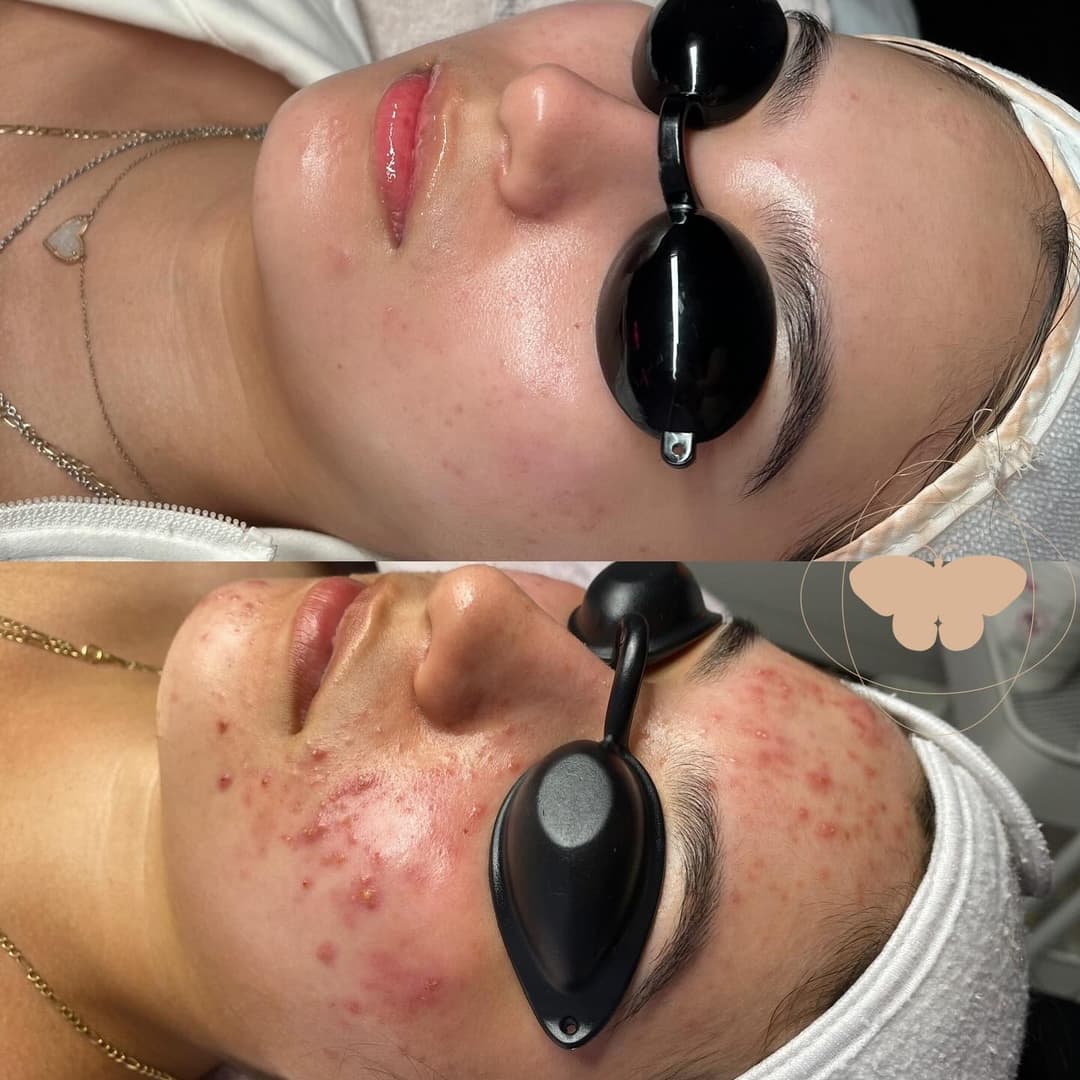
Seeing progress like this is why I do what I do! Helping my clients feel more confident in their skin is the best part of my job. With the right care and patience, clear skin is possible❣️ Ready to start your skincare…
CTA: Visit Instagram profile
Hook: The same client under treatment twice, stacked top and bottom: inflamed acne in one shot, clear skin in the other.
Why it works
The before and after is the whole argument. It was taken in the treatment room with protective eyewear on, which makes it read as real work rather than a stock image. The caption keeps the tone personal ("why I do what I do") and promises patience, not a miracle.
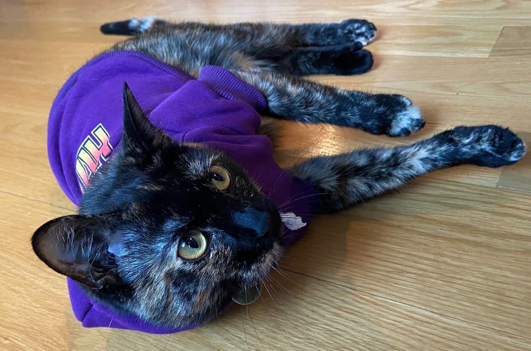
The Original Cat Merch Brand Born out of love of cats and music. Now with apparel for your furry friends!
CTA: Shop now
Hook: A black cat sprawled on a wooden floor wearing a purple branded hoodie.
Why it works
A cat in a hoodie is an instant scroll stopper, and it also shows the brand's newest product line: apparel for pets. The copy tells the brand story in one sentence, born from cats and music, which gives fans a reason to feel part of it. It has run since April 2021, the longest on this page.
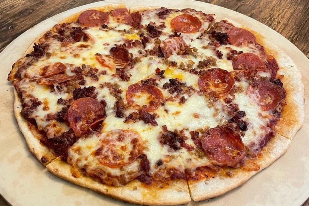
Homemade doughs and sauces! Homemade Sandwich breads! Delivered to your apartment or office?! Checkmate.
CTA: See menu
Hook: A pepperoni and sausage pie shot from above with the copy ending on "Checkmate."
Why it works
The pizzeria leans into its odd name with a one-word pun, which makes it memorable in a feed full of interchangeable pizza photos. The copy also makes a concrete promise (homemade doughs, sauces and sandwich breads, delivered to your apartment or office) and sends people to the menu.
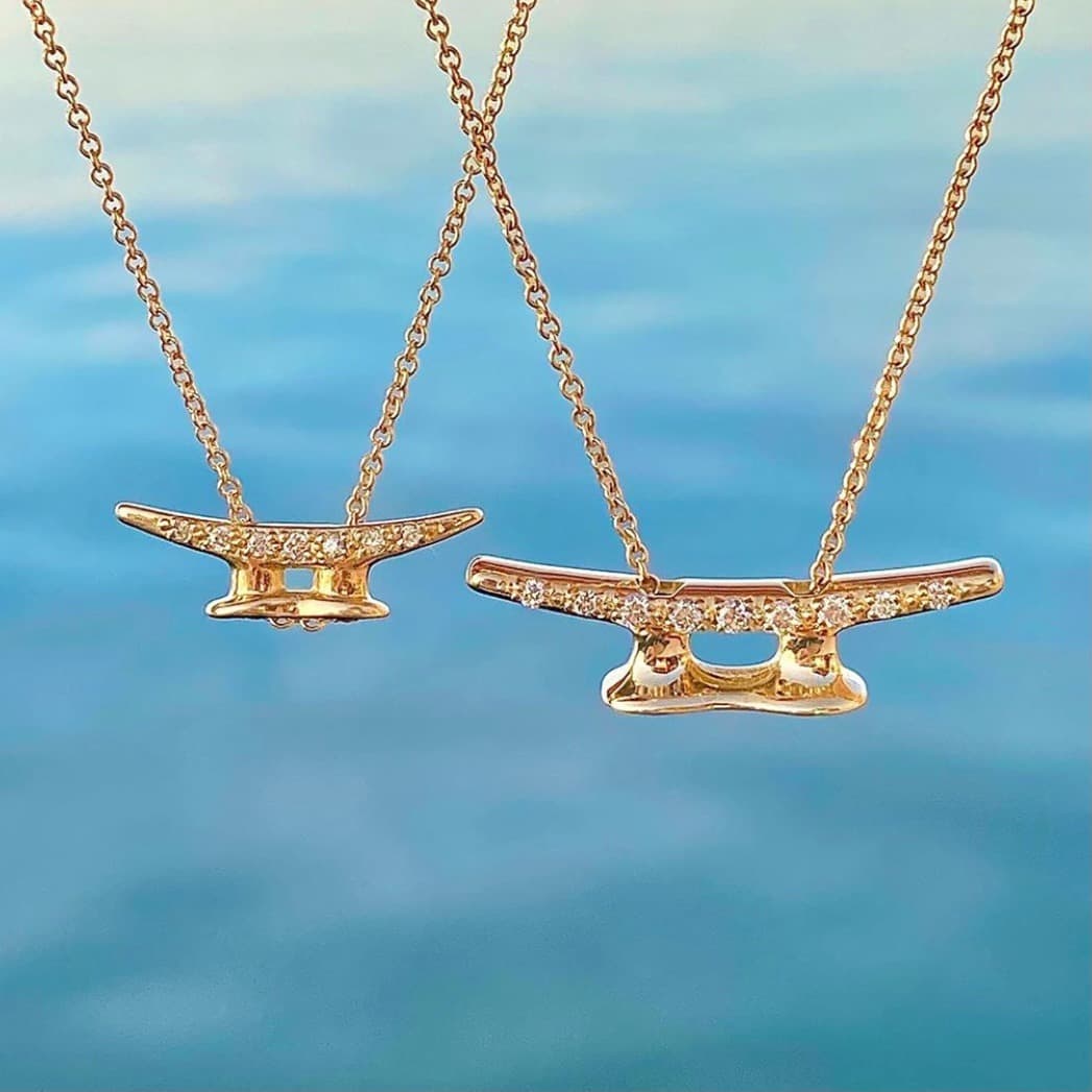
Shop online and save 10% on our bestselling nautical jewelry collection, available in sterling silver and solid 14k gold. Use the code NAUTICAL10 at checkout; exclusions may apply.
CTA: Shop now
Hook: Two gold boat-cleat necklaces float over bright blue water, so the nautical theme lands instantly.
Why it works
The background does the storytelling: you know this is jewelry for people who love the water without reading anything. The copy is plain and practical, naming the metals (sterling silver and solid 14k gold) and a clear code, NAUTICAL10. Running since early 2021 is a strong sign that a tight niche and a simple offer can carry an ad for years.
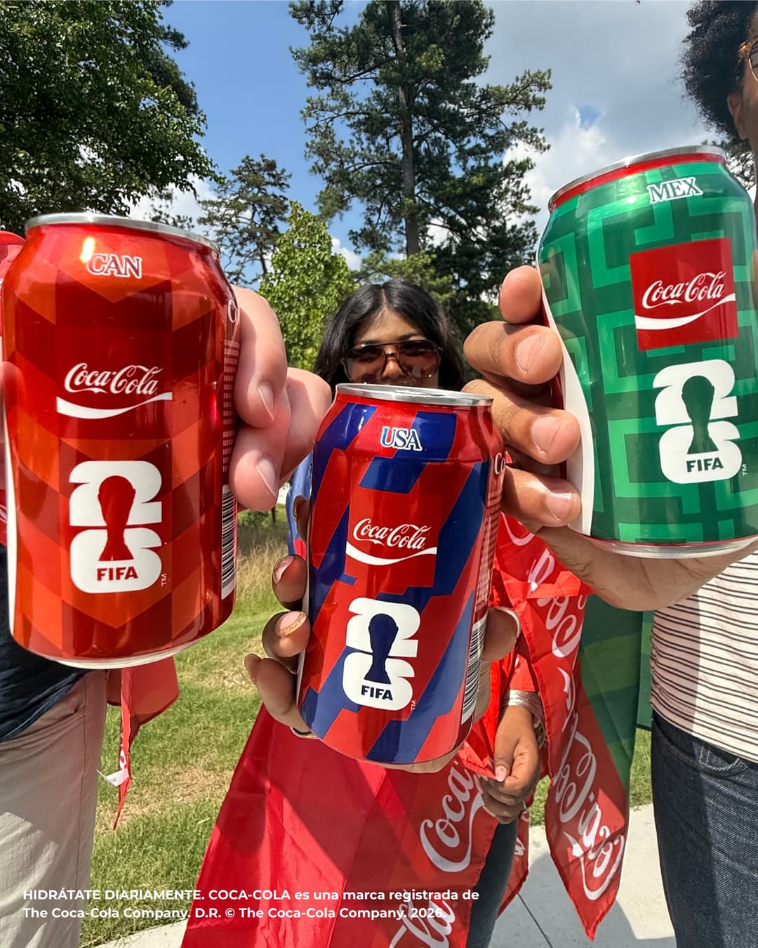
Cheers to all three host countries for advancing to the knockout round 🇨🇦🇺🇸🇲🇽 Ahorita vengo, estamos haciendo historia 🇲🇽 Ahorita vengo, estamos haciendo historia 🇲🇽 Three cheers for that 👏🇺🇸👏 Trois pays.…
CTA: See details
Hook: Three friends push special-edition cans for Canada, the US and Mexico toward the camera.
Why it works
The cans are the headline, so the message lands before anyone reads the copy. The caption runs in English, Spanish and French, which lets one ad speak to all three host countries.
Patty's Cakes and DessertsRunning since August 2026
Carousel · Facebook + Instagram
Patty's Cakes and Desserts
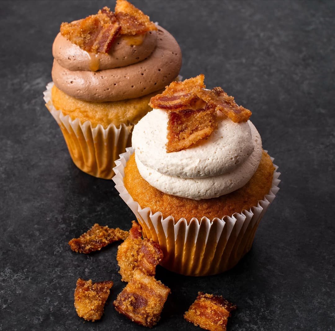
The lineup you didn’t know you needed 🤎 Cinnamon. Bacon. Peanut Butter. Each bite better than the last. Order online and schedule for $5 local delivery or pickup 🍰 pattyscakes.com”
CTA: Shop now
Hook: Two cupcakes with swirled frosting topped with shards of candied bacon on a dark slate surface.
Why it works
Bacon on a cupcake is unexpected, which makes people stop and look twice. The copy names the three flavors in quick, one-word beats and then states the delivery price, $5 local, plus scheduled pickup. The dark background makes the warm frosting colors pop.
Open the launcher above, which runs the Meta Ad Library with a search already filled in. Pick your country.
Switch the filter to active ads and search your product type with words such as "swipe", "shop the collection" or "5 ways".
Open ads that show several cards. Read the start date and note how many cards the advertiser uses.
Download the creatives with the Meta Ad Library downloader and write down the headline of every card in order. That order is the sequence to study.
How does a good carousel ad flow, card by card?
This page doesn't hold a gallery of every carousel ad, and we don't invent ads. A few annotated carousels from our small snapshot of the Meta Ad Library may appear here as samples, not a count. These are the sequences advertisers repeat:
Story sequence: problem, cost of the problem, product, proof, offer.
Product showcase: one product per card, price in the headline, each card linking to its own page.
Step by step: numbered cards that teach a small how-to, with the product on the last step.
Benefit per card: one benefit, one image, one short headline each.
Review stack: one customer quote per card, offer on the final card.
Listicle: card one promises "5 mistakes", cards two to five deliver them.
Panorama: one wide image split across cards so the swipe feels like a reveal.
Facebook carousel ad examples with images: what each card needs
Plan for people who never swipe. Card one has to work as a single image ad, with the hook in the picture or the first line of text. Keep one visual system across cards: the same ratio (1:1 is the common choice), the same type size, the same color logic. Text has to stay legible at phone size, so cut anything that needs zooming.
Example copy, written for this page. Quill & Pine is a made-up planner brand, story sequence:
Card 1, headline "Your to-do list is not the problem". Image: a crossed-out list.
Card 2, "Every task has the same weight". Image: one list, all items the same size.
Card 3, "Plan by energy, not by deadline". Image: the planner page with three blocks.
Card 4, a real customer line as the headline, if you have one. Image: the quote on a plain background.
Card 5, "Start the first week free". Image: logo, offer, button.
How to judge the best Facebook carousel ad examples you find
Three signals separate a carousel worth studying from one that just happens to be in the library. It has been active for weeks or months. The advertiser runs several versions of it, so they are iterating on something that works. And the card order tells a clear story instead of reading like a catalog dump.
On your own ads, test the card one hook first, then the number of cards (three against six), then a carousel against a single image of the same product. When your sequence is a story, turn off Meta's option to reorder cards by performance, because the story only works in order.
Carousel setup limits and rules
Meta allows 2 to 10 cards, each with its own image or video, headline and link. Use that: send each product card to its own page and the last card to the offer. Keep headlines short, since long ones get cut off on small screens. Every card is reviewed on its own, so one card with a before and after image or a line like "Struggling with debt?" can get the whole ad rejected. Check each card against the personal attributes rule, and keep every card's claims to things you can prove.
Frequently asked questions
How many cards should a carousel ad have?
Three to five cards covers most stories. Go higher only for a real catalog where each card is a different product. Test three against six rather than guessing.
Is a carousel better than a single image ad?
Not by default. A carousel earns its place when you have several products or a story that needs steps. For one product and one message, a single image is faster to make and easier to test; see the static ad examples.
Where can I see Facebook carousel ad examples from my industry?
Open the Meta Ad Library with the launcher, search your product type, filter to active ads and open the ones that show several cards. Note the card order and the start date.